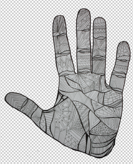
I wanted to just start getting stuff on paper so decided to do a detailed illustration of a hand. The concept being - hands have so much more to say than we think. I do like this asthetic but I realise it needs pushing a lot further as there is no real back bone to it.

I mocked up a poster and logo just to see how it could all sit on the page and whether the aesthetic works at all. From asking a few peoples opinions I got some positive feedback but also some good ideas as to how to take it further.
I would like to draw hands doing sign language rather than just looking pretty.


 I mocked up a poster and logo just to see how it could all sit on the page and whether the aesthetic works at all. From asking a few peoples opinions I got some positive feedback but also some good ideas as to how to take it further.


