Showing posts with label Brief 1. Show all posts

Wednesday, 30 May 2012

Volunteer festival Boards and Evaluation

This brief has really shown me how one well executed concept can be spread across such a range of products.  It took me a long time to really pin down the key visual of this brief and it was only through the easter holidays that I decided upon it but once 'work hard, play hard' had been discovered and with it the illustrated type and linking lines it seemed that there was so much that could be done with it to extend products further.

A number of things were not right within this such as copy within the publications,  a lot of the time I wanted to show how it would work and so didn't think up different copy text for each guide or programme.  This is a flaw in my organisation as it was something I wanted to do but in terms of priorities it was not high on my list.  I realise though the importance of attention to detail and this has really taught me to understand that small things (within type and layout) often take much longer than anticipated.

The website is another down fall as I had focussed mainly on the printed products and the website fell back to being just a mock up.

Overall I am happy with the range of this brief and it holds together nicely. I wanted to focus on distribution as well as range and so did make sure this base was covered. This just means it actually all pieces together.

Sunday, 27 May 2012

second attempt...


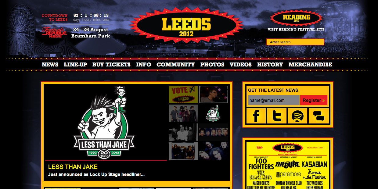
Inspiring websites

 All these websites just seem to work.  I need to becareful that I don't overcomplicate the space and realise that I don't have to be limited to a box in the middle.

The aim of the website is to inform about MYM and a place where people can book so this needs to really stand out in the design layout.


Saturday, 26 May 2012

Really not feeling it...

 The website I am trying to create just isn't working. I struggle to think within the small box and then go to the extreme of really limiting what I can do.  This all looks out of proportion and awkward.  Really need to search further for websites that work. 


Splash page

 As MYM will change location every year I think it would be good to have a splash page which does the same.  The imagery which occurs will change depending on where it is held.  I have created a little gif to represent when you scroll over the MYM logo it changes to 'work hard, play hard.'

Friday, 25 May 2012

Festivals and other websites.

I have been looking around to be inspired for my MYM festival website as I feel a bit stuck on how to go about it.  Of course it has got to continue with the theme of the whole festival.  
I like it when photographs are used as changing images and I may introduce this as I feel it will need breaking up with some photographic in put.


Thursday, 17 May 2012

Programme layout

On arrival to the festival each group or individual will receive a pack.  Within this will be a programme with details of times, places to meet and jobs/entertainment which will be occurring.  It is important that it is clear and concise and not over complicated.  I am keeping them small so that they really are pocket guides.


Monday, 7 May 2012

Finals


I think at last I have decided on a finished look. This will run consistently though the range of products for the festival.  I am undecided between green and grey so will need to get a number of opinions tomorrow to decide its fait!
I think I am happy with this.  If I need to redraw the work hard play hard - it should not take long and I can just add it in place of the current one.


Colour Change.

I originally wanted to screen print the main colours of the poster.  I loved the flourescent green and blue together and felt it was a new take on being green but the more I think about it the less realistic this seems.  If I want to screen print and laser print the posters and guides then it seems it would turn into a more costly experiment than it necessarily should be.  In terms of a project which is ethically based it would not make as much sense to use screen printing as the main theme of production as it would just be too expensive. Therefore I have started to reconsider the colours so that they are laser printer friendly!


I want to stick with using green as this seems like the best way to show it is an environmental festival.  Obvious - yes, but it works.  Green is generally hard to print so I will have to do a few test prints to get this right.