Showing posts with label Design Context. Show all posts

Sunday, 27 May 2012

Inspiring websites

 All these websites just seem to work.  I need to becareful that I don't overcomplicate the space and realise that I don't have to be limited to a box in the middle.

The aim of the website is to inform about MYM and a place where people can book so this needs to really stand out in the design layout.


Saturday, 12 May 2012

Think Big

After crafting the type for the promotional posters I felt quite disapointed when I put it all together. I don't think it really does the book justice and so want to rethink the way I am doing it.  I think it may have been a rushed decision as I wanted to meet my personal deadline as best as possible and was focussing on creating stop motion animations where this may not be the smartest way to work.  

Instead I have been drawn back to peepshow collective who created this fantastic window display for saatchi and saatchi showing their personal design process.  This made me think that the concept I have consider is one of bringing things to life and so it needs to scream life and excitement and colour.  

I would love to create a beautiful window display for bookstores which would catch the eye of people walking past and make them want to bring the books to life.  There is no point the promotional material being dull in comparison to the books as this is what gets people to look at the books in the first place. 
I feel much more excited about this which is what I should be as I feel it is something a bit challenging and different and works perfectly with the sort of design I want to produce.  


Saturday, 5 May 2012

Studio Beige

This publication and diary by studio Beige as a brilliant balance of information and inspiration.  I love the use of quotes throughout the book plus the range of images and illustrations used to express being green.  
I want to take inspiration from this and make the planner on arrival and the guide through the post interesting and inspiring through use of images and quotations about the environment, working hard and playing hard.  


BRIGHT COVER

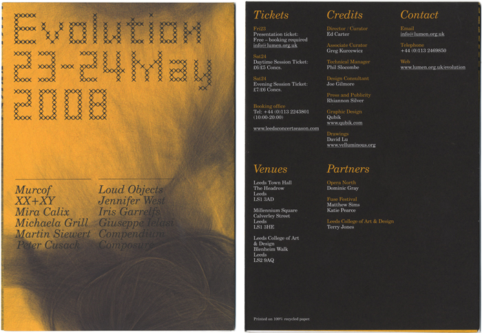
I really like this programme - again from Qubik.  
The front cover is gorgeous.  I really want to be able to screen print the posters and covers for this project so that it has it's only personality with colour.  Again Joe has managed to include a lot of information whilst keeping it clean. I appreciate the use of white within and the colour on the cover though I would like to add a little flare on the inside as well. 


Folded info - Qubik

Joe Gilmore has produced this info booklet for Evolution - an art event. It seems to work really well and looks really clean even thought there is a lot of information.  He has similarly put the ad poster on the inside so that it can be reused.  Good context to show that it can work.