Wednesday, 30 May 2012

Sponsored Sign Language Boards and Evaluation

Evaluation


This brief was initiated to understand distribution and audience participation.
I wanted to create work which was easy to understand and useable covering all the bases necessary. After completing this I feel it was actually one of my favourite briefs as I was able to work with colour format and it was an ethically based subject. I like creating something fun and colourful for a good cause.
Overall it is a similar evaluation to the rest as I have realised the little things to the longest.  I am happy with the distribution side of things but little parts like t-shirts and the basics guide have fallen short of being truely finished due to time availability and organisation.  There are aspects of this which work well and the consistency works well - I am happy with this. Also I am happy with the illustrations and the image lead base of the brief due to its subject.

Tidying the edges will always be important and I just need to makesure the little things are considered as I complete a brief.

Volunteer festival Boards and Evaluation

This brief has really shown me how one well executed concept can be spread across such a range of products.  It took me a long time to really pin down the key visual of this brief and it was only through the easter holidays that I decided upon it but once 'work hard, play hard' had been discovered and with it the illustrated type and linking lines it seemed that there was so much that could be done with it to extend products further.

A number of things were not right within this such as copy within the publications,  a lot of the time I wanted to show how it would work and so didn't think up different copy text for each guide or programme.  This is a flaw in my organisation as it was something I wanted to do but in terms of priorities it was not high on my list.  I realise though the importance of attention to detail and this has really taught me to understand that small things (within type and layout) often take much longer than anticipated.

The website is another down fall as I had focussed mainly on the printed products and the website fell back to being just a mock up.

Overall I am happy with the range of this brief and it holds together nicely. I wanted to focus on distribution as well as range and so did make sure this base was covered. This just means it actually all pieces together.

Sally Hargreaves ceramics Boards and Evaluation

Evaluation

I went into this brief with an understanding that it is different to anything else I have produced so far.  My hope was to really engage with the whole identity and brand of a company like Sally Hargreaves ceramics where there was an understanding that the brand really represented the company.
I really feel like the logo is very strong within this set.  Probably the strongest thing about the brief.

The main fall back within brief was the amount of time it took to finalise little details.  It was the first brief I finished but whether it was ever completed I am not sure.  With it being the first brief I got stuck into I enjoyed doing it but got carried away with time.  The catalogue took double the amount of time I had hoped it too meaning that other work got pushed to one side.  I don't feel that the cover of the book is particularly as strong as I wanted it to be but I am really happy with the layout and how it reads - I think the time it took payed off.

Over all the work photographed really well and it was at this point that I felt it really came together.  The consistency was vital and this really is shown in the final images.


Interdisciplinary Year Book Boards and Evaluation

This collaborative brief was like no other throughout my degree.  With it being live there was a lot of influence by the client which I thought was a brilliant thing.  Arthur, Aaron and I really were in line with there thoughts and ideas and were able to work out something which really highlighted what they wanted with out taking over.
The difference within this brief was my personal input.  My main job was concept development, attending meetings, finishing/making of the exhibition boards.  There was not much design involved on my part.  This was hard for me to really feel like it was a brief I too part in although I did have a lot to do with the concept and was involved in every area.  We delegated well and worked efficiently, Aaron was ideal for layout as this is his area of expertise, Arthur was project manager and corresponded with Interdisciplinary course.  I came up with ideas, concept, and played around with some visuals myself.  We all had to be organised and efficient and I think that is was we were and we produced a book which we are proud of.


Hand Crafted Book Covers Boards and Evaluation

Evaluation.

I really enjoyed this brief and really had hoped to of been able to push it much further but due to time availability and my lack of balance, possibly, it didn't happen.
The idea over all was to get crafty and create something different to other book covers I have seen and I feel like that is exactly what I have done.  I wanted each book to appear individual through the fact that every single book is different.
I feel I want to continue with the brief after the hand in purely because it has so much back bone and can be pushed so far and with the extra time and less pressure I could imagine I will be able to create something else with it that completes it nicely.
There are little which could have changed to be improved - the photography. - I think overall it would have been great to of set all this up properly in a studio space with proper lighting and equipment.  Editing of images - There are some little details within the images that went unchanged due to time restraints so I have really understood the importance of efficiency in alterations and design.  The little things tend to take a long time.


Tuesday, 29 May 2012

Evaluation


OUGD303
Joanne Catlow
Evaluation


I feel that each brief I have done over the past four months has in some way represented who I am as a designer and I feel really lucky to of been able to choose subjects which matter to me and to of created work which I enjoyed. This in itself highlights my first point. I have come to the conclusion that you need an open mind with design. So often throughout this module I have said that I am a certain type of designer to then realise the pocket I put myself in has in fact restrained my inspiration to try new and exciting things purely because I want to use, for example, colour. I have learnt that I must approach a brief undecorated and with a fresh design head on.

Generally I feel I have worked hard throughout the past four months, although, as ever, the initial motivation lacked I have finished my briefs happy with my portfolio and the amount of hours I have put into it. It seems though that I will have to be more strict with personal deadlines and organisation. Although I feel I have worked consistently I have let myself down in the areas of documentation – on my blog, project file and in one or two tutorials I was unable to get out what was necessary as it seemed as though I had nothing. I don't plan on making the same mistake twice but understand that, unless I put something in place, it is bound to happen again as it seems to be in my nature. I want to be professional and efficient, as all graphic designers do and so realise the importance of this for my future career.

It has been these last few months which have taught me about attention to detail with typography, colour and layout. The importance of each element of a brief being as strong as each other. I don't feel my work is there yet or at such a standard, even though in hind sight I can see how it could become that way. This does not disappoint me as I feel I have also developed a healthy understanding of the learning process where I feel that I still have a lot to learn and absorb over the next forty or more years and hope to never stop learning.

I am glad to say that my skills on software have definitely improved since the last module and I feel confident using photoshop, illustrator and InDesign where before there was much need for improvement. I feel I have shied away from my Design presence without realising. This may ultimately come down to struggling to know how to brand myself within such a competitive design culture. I know the importance of putting this right over the next few weeks, if not days.

Sunday, 27 May 2012

second attempt...


Inspiring websites

 All these websites just seem to work.  I need to becareful that I don't overcomplicate the space and realise that I don't have to be limited to a box in the middle.

The aim of the website is to inform about MYM and a place where people can book so this needs to really stand out in the design layout.


Saturday, 26 May 2012

Webpage development.

the idea with this page - which links from the ndcs website is that it is simple and just gives the info they need so that they will sign up to info they need to find out more.  I have kept the same signs as on the posters which ask the question why, what and how and when they are clicked on the information will scroll out from them.  I have also kept the colours consistant with the promo material. 


Really not feeling it...

 The website I am trying to create just isn't working. I struggle to think within the small box and then go to the extreme of really limiting what I can do.  This all looks out of proportion and awkward.  Really need to search further for websites that work. 


Splash page

 As MYM will change location every year I think it would be good to have a splash page which does the same.  The imagery which occurs will change depending on where it is held.  I have created a little gif to represent when you scroll over the MYM logo it changes to 'work hard, play hard.'

Friday, 25 May 2012

Context publication

Festivals and other websites.

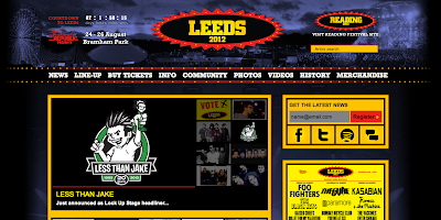
I have been looking around to be inspired for my MYM festival website as I feel a bit stuck on how to go about it.  Of course it has got to continue with the theme of the whole festival.  
I like it when photographs are used as changing images and I may introduce this as I feel it will need breaking up with some photographic in put.


Friday, 18 May 2012

Posters What, Why, How

I have just been making alterations to the posters which I initially printed and now changed due to feedback.  I felt that the hands on all were too large and also wanted to make the personal poster - which people receive in the pack a little different so that the text is more important.


finishing details for pack

Editing images